Correlation refers to the way the values of two sets of numbers vary together. For example, if the numbers are stock prices, and the price of one stock goes up at the same time the price of another stock goes up, the two stock prices are positively correlated. If the price of one stock drops when the price of the other goes up, the two stock prices are negatively correlated. If there is no consistent pattern in the variation of the two stock prices, they are uncorrelated.
The strength of the correlation between two variables such as two stock prices is measured by the
correlation coefficient. If two stock prices have perfect positive correlation, their correlation
coefficient will have the value of +1. If they have perfect negative correlation, their correlation coefficient
is –1. Otherwise, their correlation coefficient will have a value between –1 and +1. If the two stock prices
do not vary together in a consistent manner, their correlation coefficient will have a value close to zero.
Illustrations:
The first illustration shows two stock prices that are positively correlated:
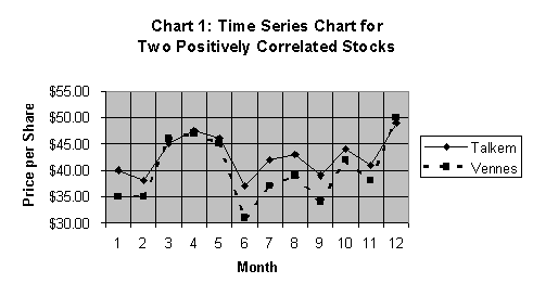
The diagram shows that the two stock prices move together—they usually increase at the same points in time, and usually decrease at the same points in time. When a diagram shows how numbers change over time, it is often called a Time Series Chart.
Instead of Time Series Charts, it is more common to use scatter diagrams to display values that vary together. The following scatter diagram for the Talkem and Vennes stocks is based on the same price data as Chart 1.
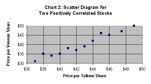
In Chart 2, each dot represents a pair of stock price values. One value is the Talkem stock price, which is read horizontally. The other value is the Vennes stock price, which is read vertically. For instance, the first dot in the diagram (the lowest one) represents $37 per share of Talkem, and $31 per share of Vennes. The second dot represents $38 per share of Talkem and $35 per share of Vennes.
As we move from dot to dot in a left-to-right manner, notice how the price of both stocks increase. The dots are close to a straight line that slopes upwards to the right. That means there is a positive linear association between these two stock prices. Low share price values for one stock are associated with low share price values for the other. And, high share price values of one stock are associated with high share price values for the other. The two stock prices vary in the same direction. Their correlation coefficient is 0.976. Since this value is so close to +1, they have a strong positive correlation.
The next chart illustrates two stock prices that are negatively correlated:
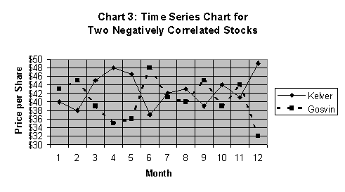
Chart 3 shows that the price per share of Kelver stock varies in the opposite way of the price per share of Gosvin stock. This means, low price values of Kelver are associated with high price values of Gosvin, and, high price values of Kelver are associated with low price values of Gosvin. If we present these data in a scatter diagram, we get one that looks like this:
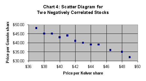
The dots in Chart 4 almost form a straight line that slopes downwards to the right. This is a reflection of a negative linear association between the Kelver and Gosvin stock prices. The strength of their negative correlation is reflected in their correlation coefficient, which is –0.984. With a correlation coefficient so close to –1, they have a strong negative correlation.
The third and final illustration shows two stock prices do not vary together in any consistent manner:
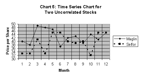
Chart 5 shows that low price values of one stock may be associated with either low or high price values of the other. The lack of correlation is more easily seen in a scatter diagram, like this one:
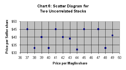
The lack of a consistent pattern of price variation is reflected by the dots being spread all over Chart 6. The dots do not form a straight line that slopes upwards or downwards to the right. The prices of Maglin and Selfor stocks have no linear association. This is reflected in their correlation coefficient, which has a value of 0.029. The two stocks are uncorrelated.
Interpreting the Value of the Correlation Coefficient
The sign of the correlation coefficient shows whether the two stock prices are positively or negatively correlated. Positively correlated stock prices move in the same directions, and have a correlation coefficient that greater than zero, but not greater than +1. Negatively correlated stock prices move in opposite directions, and have a correlation coefficient that less than zero, but not less than –1.
The correlation coefficient’s numerical value shows the strength of the correlation between the two stock
prices. The stronger the positive correlation, the closer the value of the correlation coefficient will be to +1. The
stronger the negative correlation, the closer the correlation coefficient will be to –1. If the two stock prices
are perfectly uncorrelated, the value of the correlation coefficient is zero.
It is important to keep in
mind, that strong correlation, whether it is negative or positive, does not mean that changes in the price of one
stock cause the changes in the price of the other. To determine what causes changes in stock prices, you must analyze
the companies’ financial data, and assess the overall market conditions, the economy and the industry in which the
companies compete. Stocks may be cyclical, which means their market price increases when the overall economic conditions
improve, and their market price drops when overall economic conditions deteriorate. Other stocks may be
counter-cyclical, which means their market price tends to increase when economic conditions deteriorate, and their
market price tends to drop when economic conditions improve. Two stocks may be positively correlated because both are
cyclical, while two other stocks may be negatively correlated because one is cyclical and the other counter-cyclical.
Calculating the Correlation Coefficient Using Microsoft Excel
Income should be your fundamental investment objective if you require a regular flow of investment returns to meet your ongoing financial obligations.
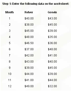
Your Excel spreadsheet could look like this:
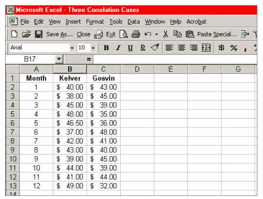
Place your cursor in a cell where you want the value of the correlation coefficient to appear, for instance, in cell B15; just point to cell B15 and click.
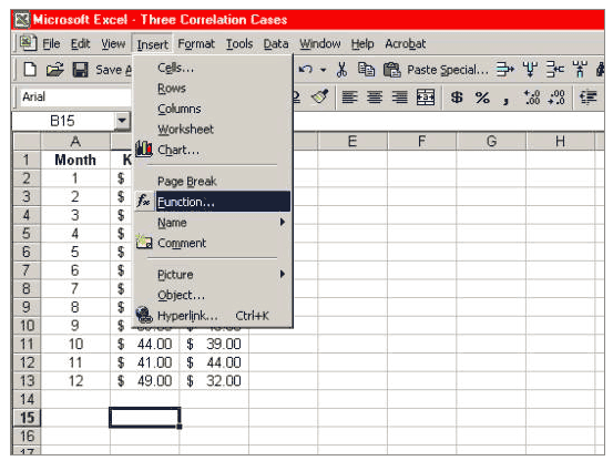
Step 2: On the toolbar menu, click on Insert > fx Function:
Step 3: In the dialogue box that appears, choose Statistical and then CORREL:
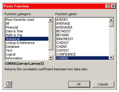
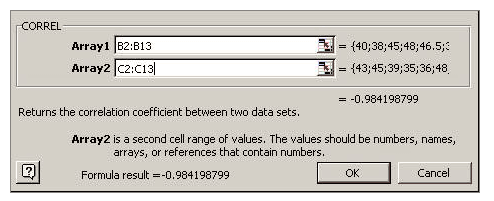
Click OK, and the following box appears:
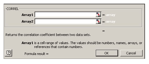
Step 4: Enter the data
To enter the numbers for Array1, type “B2:B13” in the window for Array1. To enter the numbers for Array2, type “C2:C13” in the window for Array2. The box should then look like this:
Step 5: Finish
Click OK, and the value of the correlation coefficient appears in cell B15. It should show the value –0.9842…, depending on your decimal setting, like this:
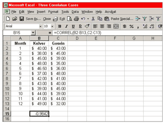
The correlation coefficient is –0.9842…; you have successfully calculated the correlation coefficient between the Kelver and Gosvin stock prices.